Using Spotify's API to Analyze Pitchfork's Best New Albums (1999 - 2017)

Table of Contents
Abstract
This project is an analysis of Pitchfork music review data posted on Kaggle. I filter the +17,000 reviews from 1999 - 2017 to only those which were given the Best New Album accolade. I then use Spotify’s API to pull each album’s derived audio features per track. This is done in attempt to methodically answer the following question: what is the particular type or types of album/s that were given Best New Music during this time period?
Music and Me - A Background to the Project
Music has always been a big part of my life. I’m a classically trained violinist, and a self-taught guitarist, bassist, and pianist. I write and produce my own music and I used to go to near 30 concerts a year.
I’m gonna cry on the dance floor the next time I can even see a concert without worrying about the pandemic. I miss going to shows.
You might have guessed it, I also listen to a lot of music. I used to carry Apple’s final iPod iteration around, the iPod Classic 160gb. I did this so I could listen to MY music collection at all times. Years into the age of streaming, I was the only one in my friend group still downloading music and putting it on an iPod. It wasn’t until I filled about 109gb of the iPod before I decided to give Spotify a shot.
Spotify was a double-edged sword solution to my musical library dilemma. The dillema being that one day, although most wouldn’t believe it, I would run out of space on my iPod. While using Spotify enables me to listen to all the music from their gargantuan library, I’m limited to listening only wherever I have service and to only what Spotify offers. That said, I still use my iPod to download music that isn’t offered by Spotify (there’s not much, to be honest) and to listen wherever I won’t have service for an extended period of time (overseas and in remote areas). For better or worse, Spotify has reshaped the way I experience music by simply impacting how available music is to me and through their recommendation services (Discover and Daily Mix).
Likewise, popular music review site Pitchfork has also impacted how I might experience music. While I would never admit that I really follow the opinions of others, especially a corporate music review site, Pitchfork’s impact in culture has been documented and studied widely in academic contexts.1, 2, 3 Is it possible Pitchfork has also been shaping my musical cultural experience without my knowing? If there’s any way that I’d admit they may have, it’s through their Best New Album accolade. I’m always interested to see what albums they end up giving this distinction. While I may not always agree with their picks, I will acknowledge that a significant amount of my favorite albums by any artist are typically given this distinction. Also, it’s not atypical for me to give an artist a listen because I’ve heard their name around before and because they recently got Best New Album.
Getting the Pitchfork Data
In regards to this project, the data appeared before idea for analysis. I was going through Kaggle looking for some interesting data I’d like to work with and came across this dataset.
As it was a SQLite database file, I decided to do initial exploration using SQLite’s DB Browser before importing to RStudio to transform.
About the Data
Some observations of note*:
- 76 albums have been given a perfect 10 score
- Only 34 albums where given both 10 and Best New Album or Best New Reissue
- Only 1 album received a 10 score and Best New Album (Kanye West’s My Beautiful Dark Twisted Fantasy)
- Of 9 unique genre indicators, only two did not have any 10 albums (Global and Metal)
- They mostly gave perfect 10s to rock albums (54 albums) and then pop/r&b (11 albums)
- 44 unique authors have given perfect 10 reviews
\[*_{Bear\ in\ mind\ this\ only\ applies\ to\ reviews\ from\ January\ 1999\ to\ January\ 2017}\]
Filtering to the Best New Albums
After briefly looking over the data in DB Browser, I imported the .sqlite file to RStudio and extracted the tables into my local environment. Being as the project was beginning to form around analyzing albums given Best New Music I really wanted to make sure that we were only considering new music. To explain more, Pitchfork awards three different types of distinctions that all fall under Best New Music. Our distinction of interest is Best New Album. This is an accolade awarded to an album that is actually new music. Per Pitchfork, it’s meant to ‘[highlight] the finest music of the current moment.’ Another moniker is Best New Reissue. This is awarded to new releases that are not necessarily new in their main musical content, but are new in their packaging, bonus content, b-sides, etc. I only want to focus on albums given Best New Album because I don’t care about the albums released 30 years ago that every Pitchfork writer’s dad said was a classic. There’s no sticking out your neck when you just re-iterate what culture has taught you. Lastly, there’s Best New Track, which is like Best New Album but at the individual song level (typically for promotional singles). Thankfully this is not represented in the data.
The table of reviews from the DB file has a binary value for Best New Music and unfortunately this includes Best New Reissue. However, each review also has it’s unique URL given. To pull only the reviews that were truly given Best New Album, I developed a web crawling solution. I filtered the table to Best New Music reviews, pulled the unique URL for each review, iterated over this list with a custom function that navigated to each URL, downloaded the HTML, located the HTML node for the Best New Music <div> container and returned TRUE for any with matching text ‘Best New Album.’
Thus, I had my final Pitchfork data, a table of 629 albums from 1999 through 2017 that have been given Best New Album.
Getting the Spotify Data
Spotify assigns any music it hosts in its streaming platform certain audio features. More about this can be read here.
They have a public API that can be used to pull this data for an album, artist, or playlist. I used Charlie Thompson’s API wrapper package SpotifyR to pull the data.
Problems with the Data
Much tidying needed to be done as there were a handful of data related issues such as:
- Artists or albums not offered by Spotify
- Duplicate data for albums containing multiple versions due to censorship or having different mixes for different countries
- Removing the bonus content from deluxe versions of albums offered through Spotify
- Piecing together albums that were not by one particular artist as ‘Various Artists’ is not a recognized Album Artist in Spotify.
- Generic band names resulting in a data pull for the most popular related band name. I.e. an attempt to pull audio features for Whitney becomes a pull for Whitney Houston.
True to any data project this step, the data gathering and cleaning, took the longest.
My code will be available on Github for anyone interested in seeing my solutions.
Running the Analysis
Once I had a table representing the Pitchfork reviews for all Best New Albums 1999 - 2017 and a corresponding Spotify table of matching album audio features, I was ready to run a clustering analysis.
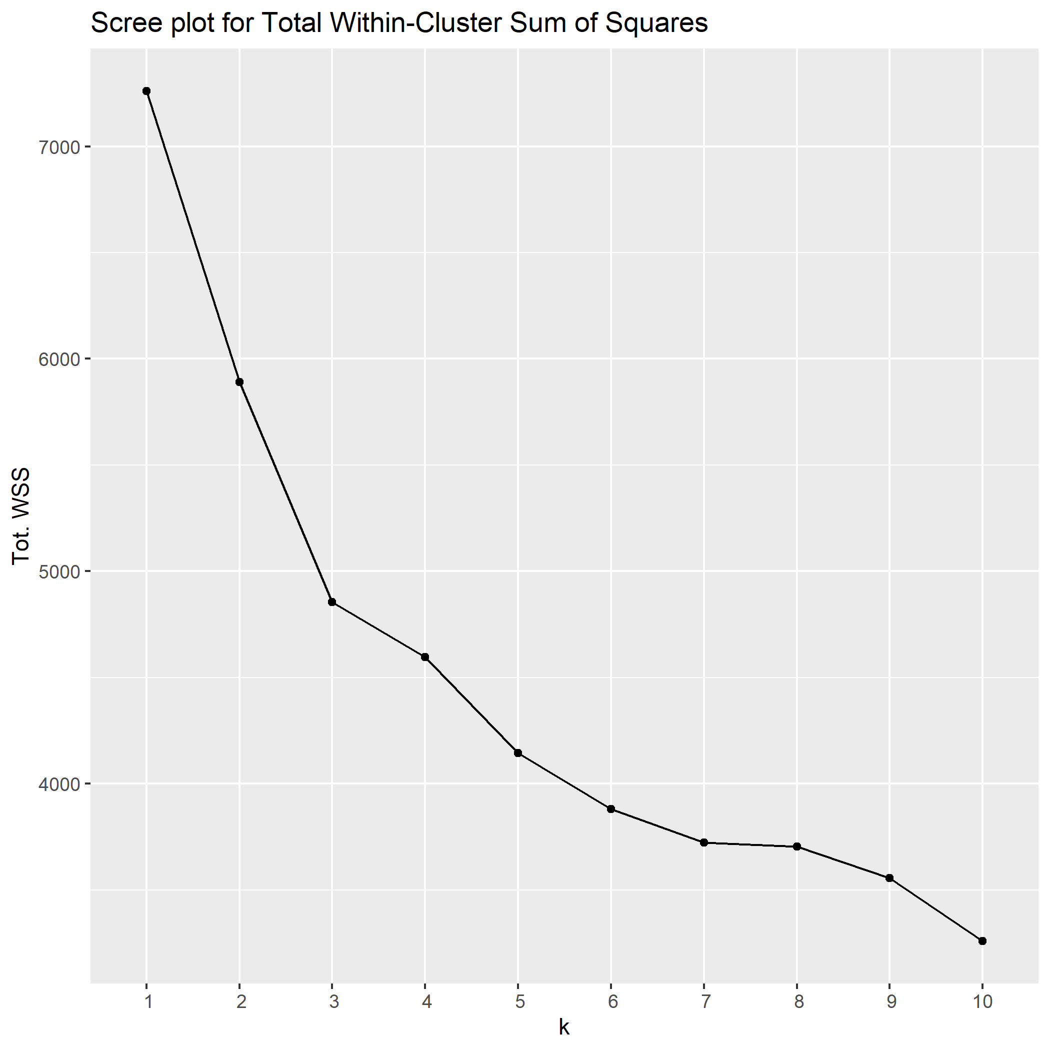
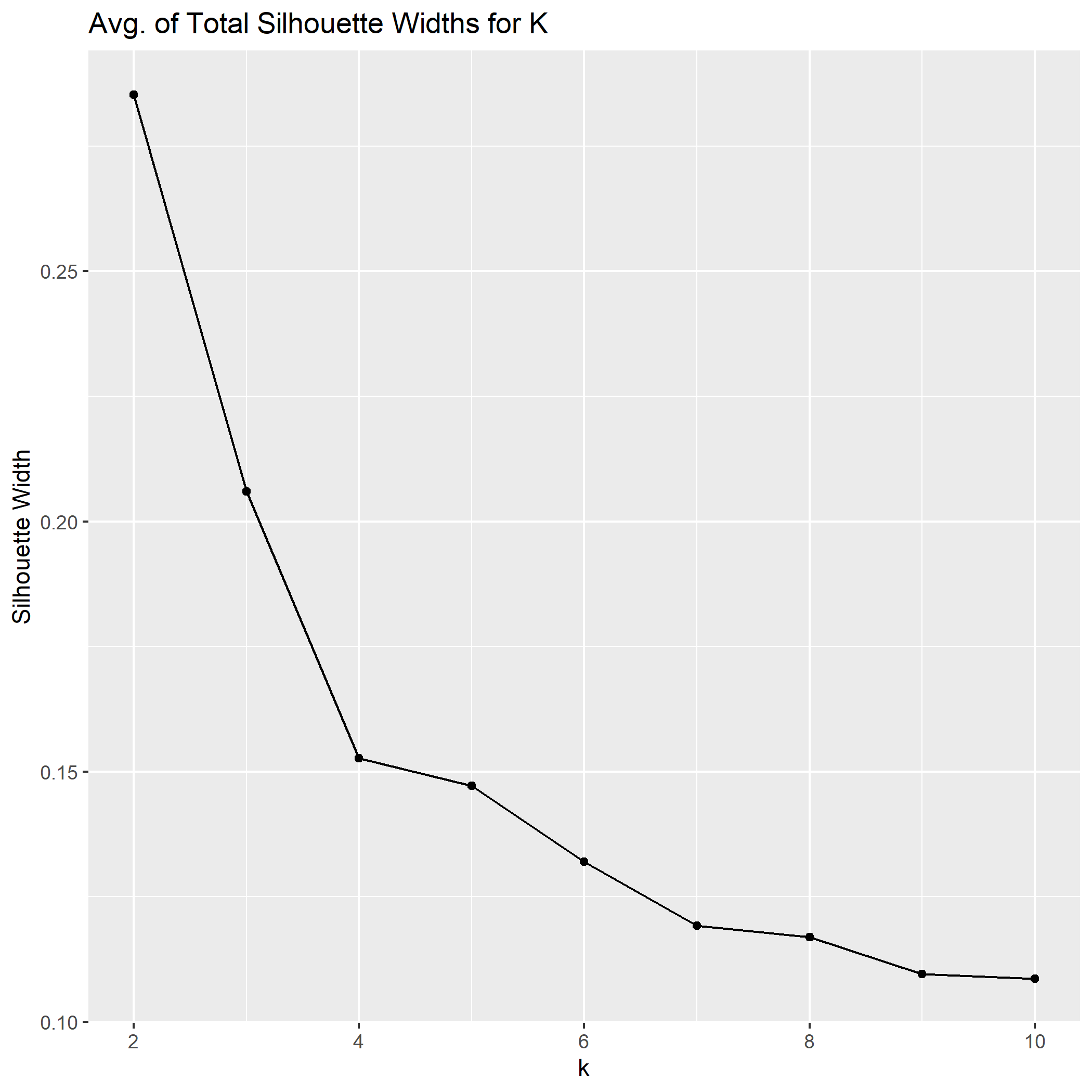
I decided to use the k-means algorithm with a scree plot and a plot of average of total silhouette width to determine what was the appropriate number of clusters for this data.
For my own education I’ll try to break this down in simple terms, but I will also provide external materials to solidify the understanding where I can’t.
What is K-Means?
K-means clustering is an iterative algorithm that takes a list of observations with n-dimensions and attempts to partition them into K amount of clusters. The inputs for this algorithm are of course the observations as data and the amount of clusters K. The algorithm then picks K amount of random observations to be the starting point of each new cluster. Every following observation is assigned to a cluster based on proximity to a starting point. Once all points are assigned, the centroid of each cluster is determined and the process begins again with the new starting points being the centroids of each former cluster. Points are assigned to a cluster again based on proximity and once all points are assigned, new centroids are determined and the process begins again. This iterates in loop until a given iteration length is reached our until a minimum change threshold is reached for the centroids. This .gif does a solid job of visualizing this process for 2-dimensional data. The concept is the same for our data, which has 12 dimensions.

Determing K with an Elbow Plot
K-mean clustering is a great algorithm to use when the value of 8 is known. For example, if we have observations of all starter Pokémon from the first video games up to now, we could use k-means clustering with a K of 3 to hopefully split them into the three starting types: fire, water, and grass. How do we go about choosing K for data where we don’t know the amount of meaningful groups? One method is with an elbow plot, also known as a scree plot.
The elbow plot in this instance let’s us know the total of within-cluster sum of squares (read: sum of squared deviation) from each observation to its governing cluster centroid. This value is computed for multiple values of K from 2 through 10 and plotted as a diagnostic line graph. The point at which the rate of change becomes markedly less (the elbow) is typically a good indication of an appropriate value for K. In this instance, the elbow plot given the data indicates a K of 3.

Determing K with Silhouette Width
Another popular method for determining an appropriate value for K is utilizing the total average silhouette width. Silhouette width is an approximate measure for a given observation that estimates how appropriately it fits within its given cluster. This measure is between -1 and 1, with -1 indicating it is not a good match, 1 meaning it is a good match, and 0 representing ambiguity for points that are in between clusters. We can plot a diagnostic line graph for values of K 2 through 10 and see what model gives us the highest total average silhouette width. In the case of this data, our diagnostic suggest a K of 2.

Read more about K-means clustering, the elbow method, and silhouette method of choosing K.
What Either Model Says About The Data
With 2 Clusters
Running k-means clustering model with K = 2 gives us two distinct groups. Being that we are working with 12-dimensional data, we can not easily visualize our observations to know the differences between the groups. Another method to know the characteristics of these clusters are to aggregate our data to the cluster level and determine the average values for all of our features. Here is the cluster analysis for a K of 2. All features except for loudness, tempo, and duration are a value between 0 and 1.
Of our 2 cluster analysis, we can say that cluster 1 is notably more danceable, more spoken-word, less acoustic, less instrumental, more upbeat and contains more expletives than cluster 2. Cluster 2 is the antithesis of that identity: notably less spoken-word, less danceable, more acoustic and more instrumental. Based on this analysis, I would think the 629 Best New Albums could be reasonably put into two clusters. The first cluster comprising rap/rock/r&b/pop records that have a solid driving rhythm that one can dance to, have more words than cluster 2 (which could be interpreted by Spotify as spoken-word), is generally not acoustic or instrumental, and has much more expletives. Cluster 2 seems as if it would be comprised of electronic albums or otherwise instrumental music that would not have as much lyrics to be confused for spoken-word and might be a little more avant-garde and therefore often times not very danceable.
With 3 Clusters
From this analysis, Cluster 1 is notably the least energetic, low in speech, highest for acousticness and instrumentalness, and the lowest for valence and loudness. From these characteristics, I would say that cluster 1 albums are likely instrumental/acoustic albums that are typically softer, slower in rhythm and perhaps sometimes ambient. Cluster 2 on the other hand has the highest danceability, high energy, the highest speechiness, the highest valence and explicit values. These might be rap/rock/r&b and pop records that are loud with a strong driving rhythm, a lot of vocals that could be occasionally read as spoken-word, but often times have a least one expletive per song. Lastly, cluster 3 is slightly more danceable than cluster 1, has the higest energy, lowest speechiness, represent mid-values for acousticness , instrumentalness, and valence, and are notably faster and shorter than the other clusters. These might be predominantly electronic albums that have higher BPMs with strong and fast rhythms that contribute to its high energy, with idosyncratic beats that are not read as very danceable.What This Really Says
At the end of the day, clustering is one of the most useful types of unsupervised machine learning, but its use only goes as far as its context of application. We could statistically say that running k-means with K of 2 and 3 give us 2 or 3 notably different groups for these Best New Albums, but what we can’t say is that these groups are meaningful in regards to albums that Pitchfork has not given Best New Album.
This project did not take into consideration all the other albums that Pitchfork reviewed but did not give Best New Album. There is the possibility that the clusters in Best New Album also represent the clusters outside of this group.
Also, some of these algorithm derived audio features from Spotify are completely arbitrary. Sure, they are mathematically derived, but can valence (how ‘happy’ a song is) really be empirically calculated on a value from 0 to 1? Where do songs that sound happy but have the most depressing lyrics fit in here? Or the other way around? So then, does a cluster analysis with this data really have any value? Maybe not, but cluster analysis as a method has a great deal of proven value.
Afterthoughts
This has been a fun project. Fun because I love music, and working with music data is actually a lot of fun too. Also because I learned a bit about web-scraping, working with APIs, and cluster analysis. I never thought that analyzing the clusters within Best New Albums would give meaningful results, but it was an exercise of pure curiosity for the results that pushed me forward anyways.
Had I more time, resources, or belief that these results would be meaningful, I’d continue my analysis to seek answers to these questions:
- Was there a meaningful change in album reviews after Pitchfork was acquired by Condé Nast in October 2015?
- Is there correlation between getting a good review and appearing in another Condé Nast editorial?
- Can we predict the score of a Pitchfork review from Spotify audio features alone?
- Are there instances of albums that have near identical audio features that get significantly different Pitchfork scores?
Acknowledgments / Shout-outs
I want to take this space to acknowledge some cool projects from other people using the same Pitchork dataset or using Spotify data.
- Robert LeCheminant’s write-up of Pitchfork Reviews
- Chris Williamson’s attempt to find the find the happiest emo song using
SpotifyR - Appu Aravind’s analysis of his own Spotify listener data
- 17 year old data science enthusiast Sameeha Alfrubasha’s project using k-nearest neighbors classification algorithm to group Spotify songs into different playlists
